Canceled: Practical Data Visualization with R |
||
|---|---|---|
| When: | October 3, 2015 |
|
| Where: | Constant Contact, Waltham, MA |
|
| Cost: | $209 through September 10 |
|
Update: Seminar Cancelled
We regret that we have to cancel the Practical Data Visualization with R seminar scheduled for October 3, 2015.We hope to reschedule this seminar at a later date.
Back by Popular Demand!
In 2014 Robert Kabacoff delivered a GBC/ACM seminar on R. That seminar was a great introduction to R, focusing on learning R and applying it to Big Data Analytics. The attendees wanted more - specifically more on using R for data visualization, graphics, and presentations. Based on this demand, Dr. Kabacoff has agreed to deliver a follow-on workshop dedicated to visualization.

Visualization in R
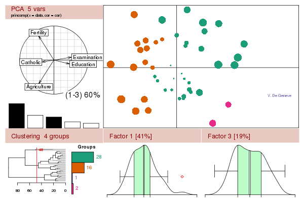
Data visualization has become a central feature of modern data analysis. The R platform provides one of the most flexible and powerful platform for graphing data, understanding and evaluating statistical models, and communicating results to others.
This day-long workshop will provide practical review of R’s major graphing capabilities, including its base functionality and exciting new capabilities provided by add on packages (including ggplot2, ggvis, and rCharts).
If you are looking at this workshop, you probably have some data that you need to collect, summarize, transform, explore, model, visualize, or present. If so, then R is for you! R has become the world-wide language for statistics, predictive analytics, and data visualization. It offers the widest range of methodologies for understanding data, from the most basic to the most complex and bleeding edge.
R is a complete system. The first challenge with any analysis project is getting the data. R allows you to import data from a variety of sources and then clean, recode and restructure it. Note that in the real world the biggest challenge is making data usable – there are always issues with the data you have to work with!
After importing data, R has many functions for summarizing, modeling, analyzing and graphing data.
Statistical analysis tools include linear and nonlinear modeling, classical statistical test, time series analysis, classification, and clustering as well as other capabilities. Further, R can readily be extended through functions and extensions; the R community is well known for active contributions of many packages.
Finally, R has powerful visualization tools. These range from simple charts to publication quality graphs, through dynamic visualization, to interactive graphics. Visualization is key to successful data analytics – it helps the person doing the analysis to better understand the results and is an invaluable tool for explaining the results to others. This may well be the most important aspect of data analytics – providing information that can be used to make decisions.
Join us in this full day seminar and learn from one of the leading authorities on R.
In This Workshop
This workshop will provide a practical introduction to data visualization using R. The workshop will be highly practical and interactive. Participants are encouraged to bring a laptop and work through each of the examples as they are described.
Course Outline
I. Introduction – R basics; importing data; the base graphics system; creating univariate and multivariate plots; customizing plots (fonts, axes, grids, titles, labels, colors, symbols, legends); saving plots in various formats (e.g., pdf, svg, png, emf, jpeg).
II. Using ggplot2 – Creating sophisticated charts with the ggplot2 package; exploring complex data, customizing ggplot2 graphs.
III. Interactive Graphics – Visualizing data interactively; using the advanced capabilities of rCharts, googleVis and other packages. Creating visualizations for reports and websites.


